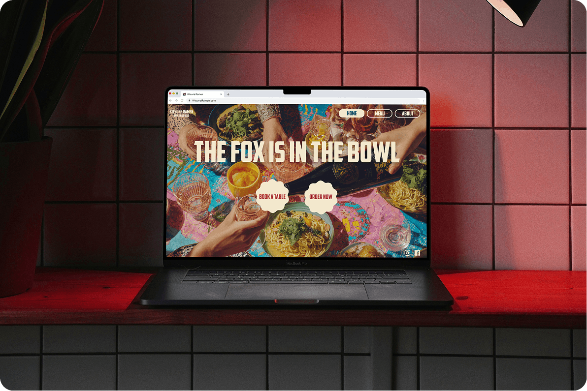
Kitsune Ramen is a concept for a Japanese-inspired restaurant designed to feel playful, warm, and culturally grounded without falling into cliché. The goal was to create a brand that appeals to both younger audiences and families, balancing character with clarity across both physical and digital touchpoints.
Ramen branding often leans into two extremes, either overly traditional with predictable motifs or overly modern, losing cultural nuance. This project responds by building a brand that feels expressive and memorable while remaining respectful, approachable, and easy to navigate in a saturated market.
The concept is inspired by the kitsune, a fox from Japanese folklore associated with playfulness, transformation, and mystery. The visual language is flexible and expressive. Soft, rounded shapes inspired by ramen ingredients create warmth and reflect the idea of fluidity. Clean, modern typography balances the playful elements and ensures clarity. A warm, appetite-driven color palette adds contrast and visibility, while illustration is used sparingly to introduce moments of character without overwhelming the system.
BRANDING


The identity extends across packaging, menus, and digital platforms. Packaging is treated as part of the experience, designed to feel tactile and engaging. Menus prioritize clear structure and hierarchy while maintaining personality. The digital system supports social media and future applications with consistency and adaptability.
The result is a brand that feels both playful and grounded, moving beyond surface-level references to build a more thoughtful visual language.